Logo & Style Guide


An exercise to build a brand for a modern urban activewear company.

Do you enjoy an athletic life but don’t identify with current sports & athletic wear?

What if there was a product that combined the awe inspiring technological innovation & science of modern athletic gear with a super sweet urban style?

Origins of the name


Tu: a pair; the French word for "you"; to work (as in leather work)
Tog: to clothe

Thinking behind the logo


The TUTOG logo is based on an exploration of dualism.
Symbols were chosen to represent the two sides of the brand.
On one side is the science behind the products, on the other side is the viceral aesthetics made to please the real life urbanite.
Colour Bars


abstract, dynamic, mechanical

Dog


organic, solid, representational

Logo Process Work

Final Logo

Type Styles


Colours


The concept behind Tutog is bold and strong. Designs should use strong black and white layouts with the brand colours for accents and backgrounds.

Sample Screens

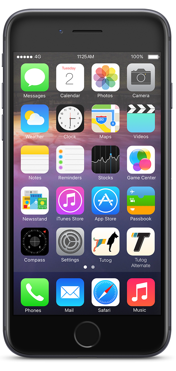
Product App Icon
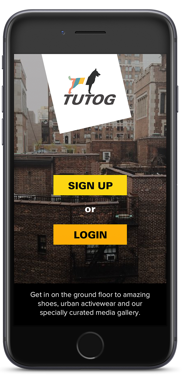
Inital Screen
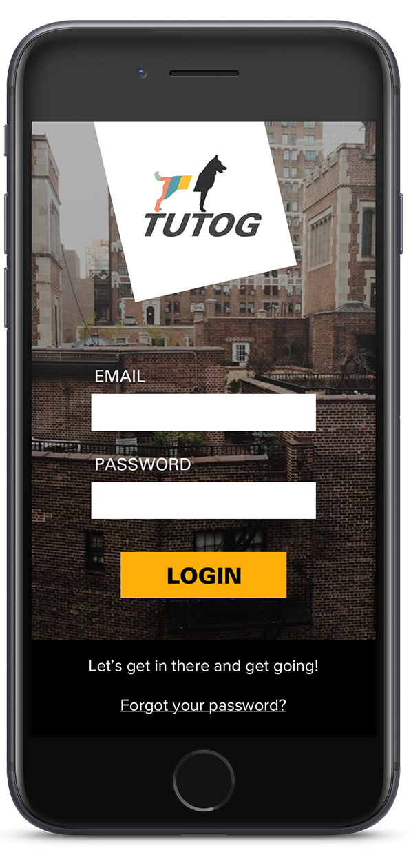
Login Screen
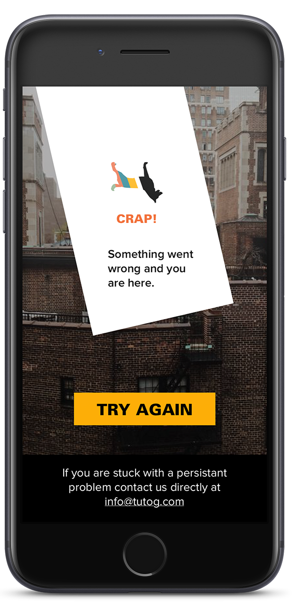
Error Screen

THE SLASH In Action


I am a designer based in Toronto Canada.

Please feel free to contact me.